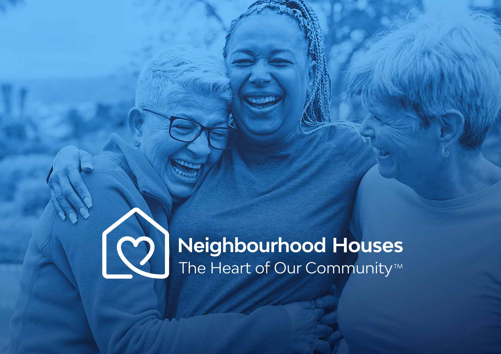
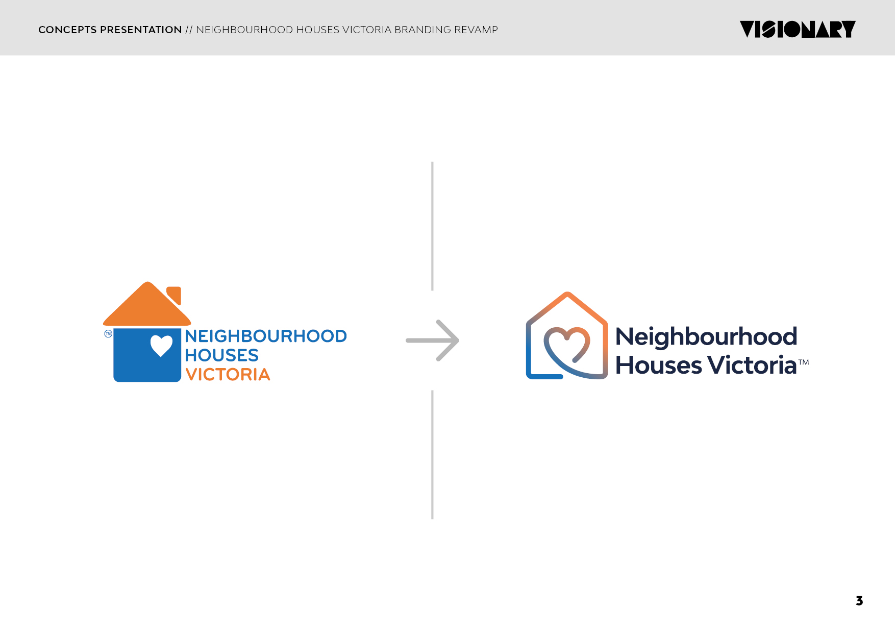
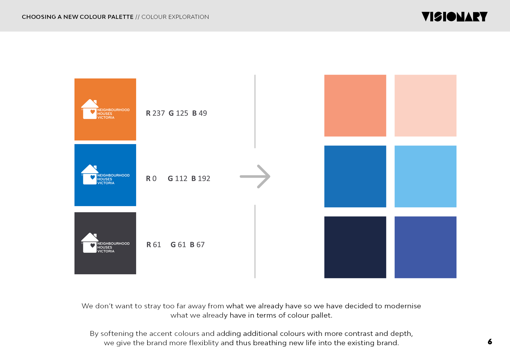
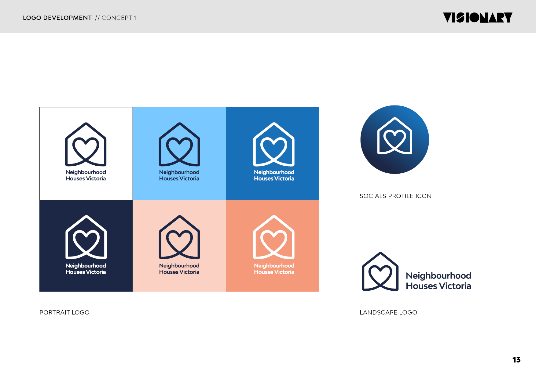
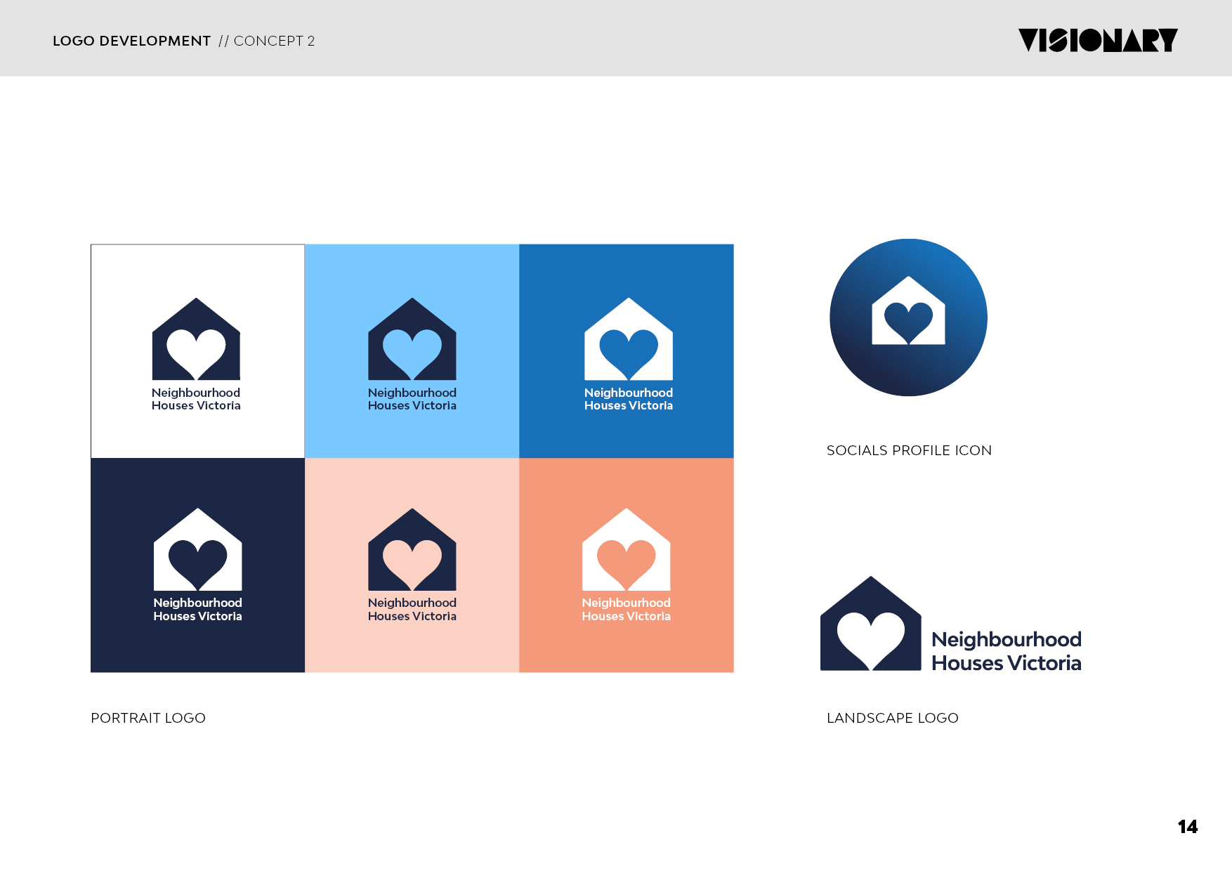
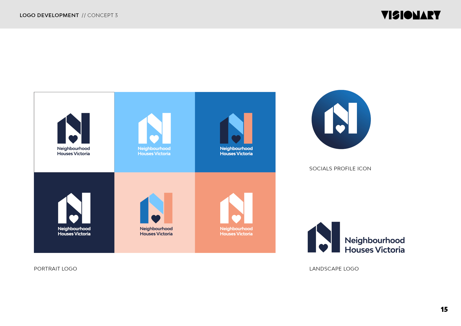
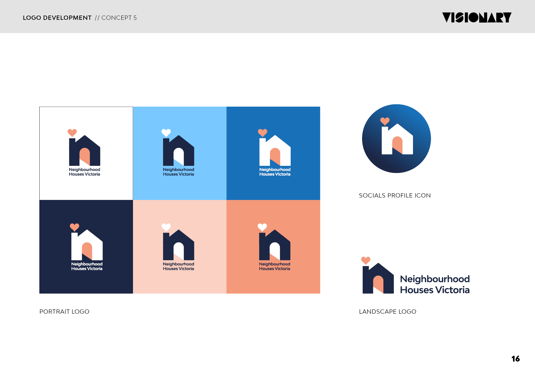
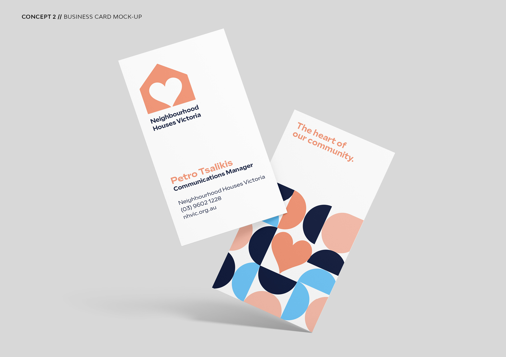
The current NHVic brand has been around for over 15 years, so its fair to say its a very reconisable mark to many Victorians. The community it serves feels very connected to current logo which is why the client did not want to stray far from the house/heart theme. They asked me to simply 'modernise it' and to make it more functional.
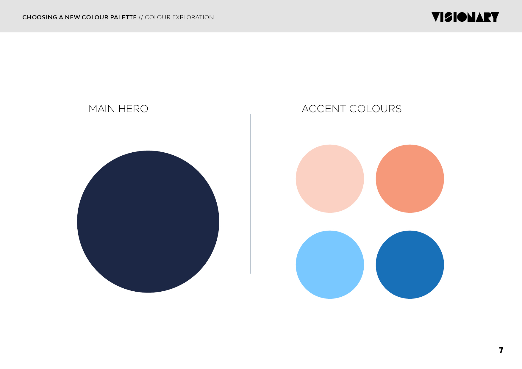
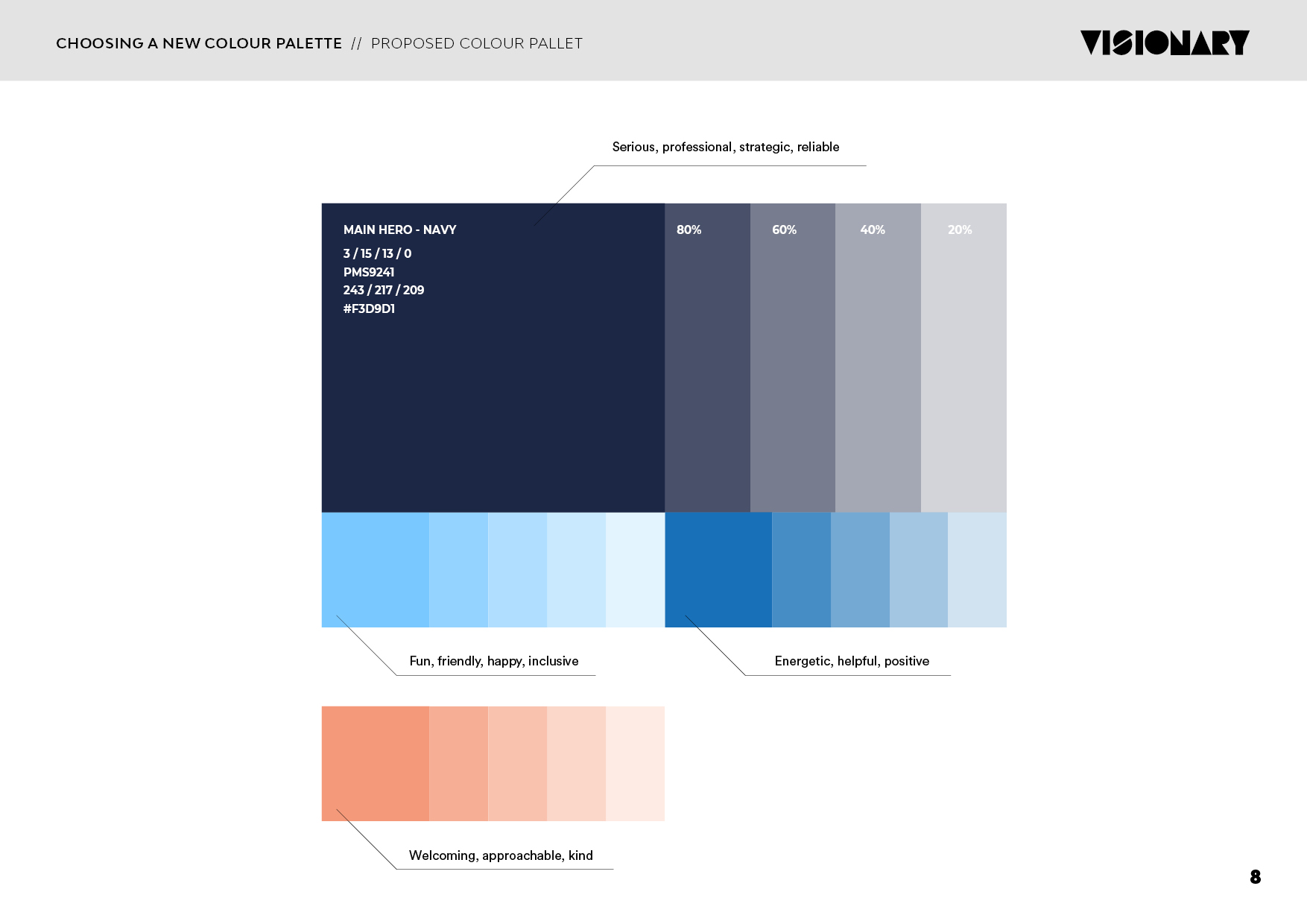
An important thing I needed to consider when designing a new look for this brand, was that it needed to straddle both sides of the fence (aesthetically speaking). On one side, we have the serious/corporate side of the organisation, the one that’s responsible for advocacy, providing expert advice on policy and law etc and then there’s the other side which is representing the Neighbourhood houses themselves, which are warm, inclusive, friendly, fun and playful spaces.
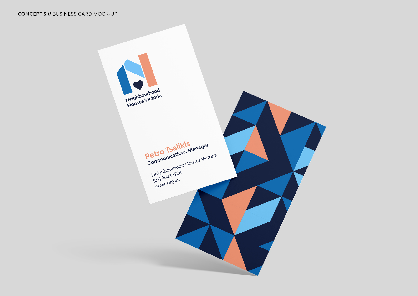
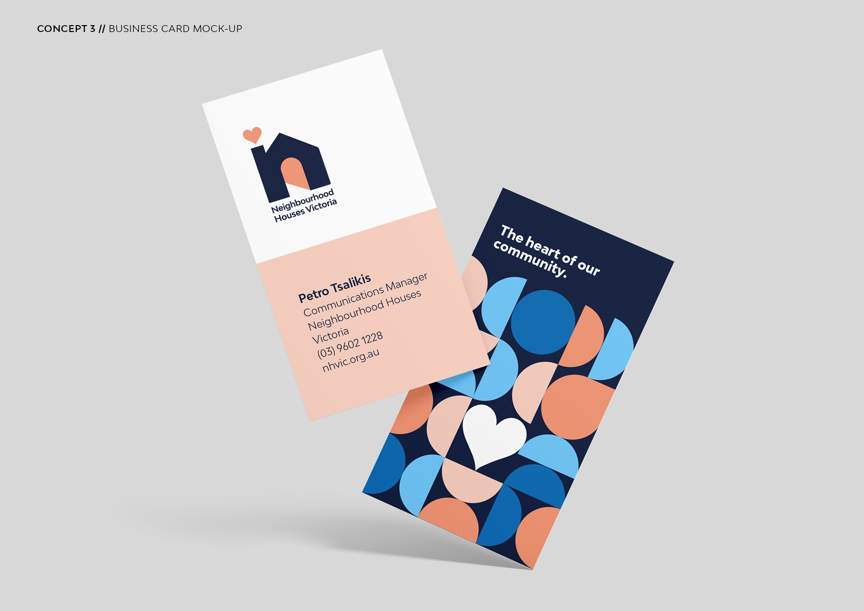
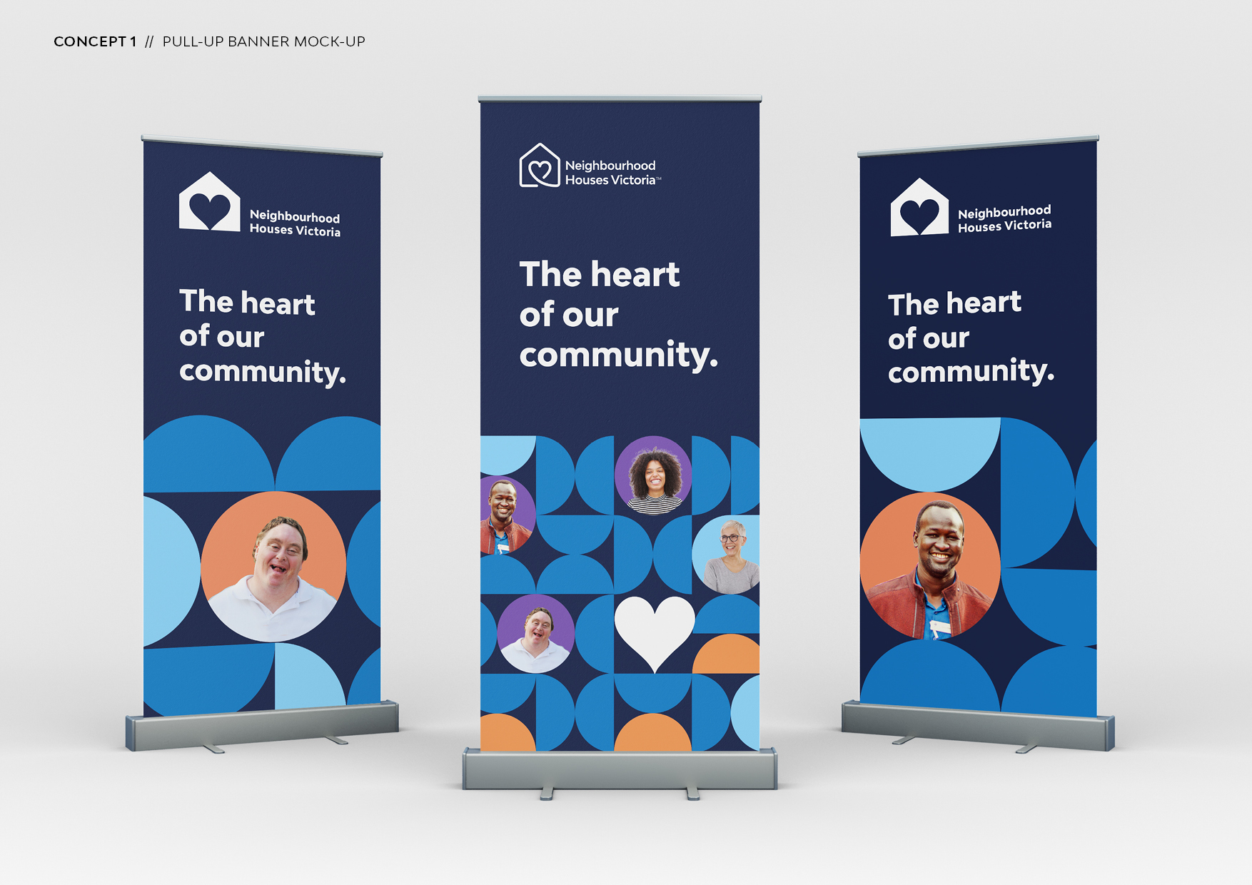
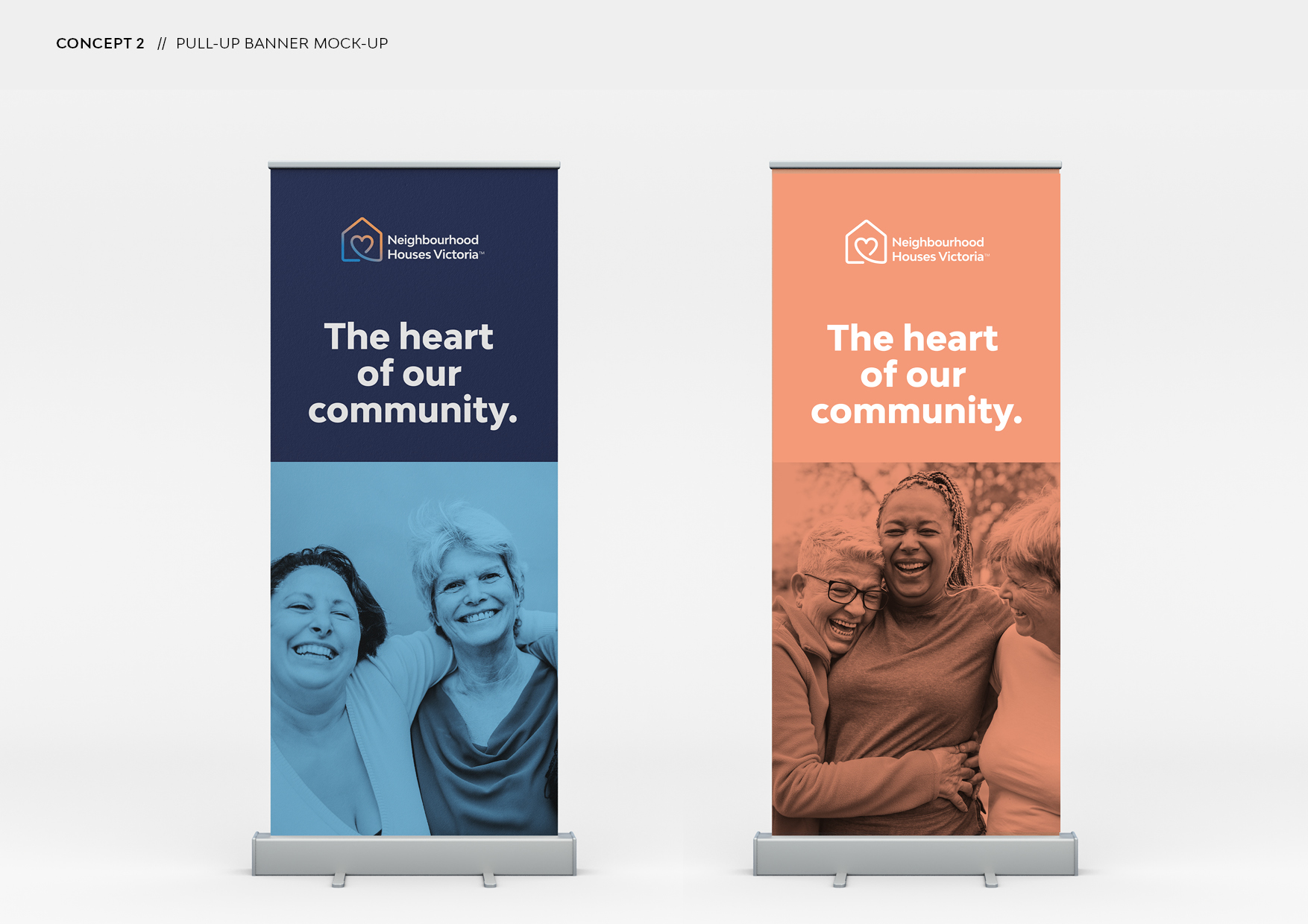
These two characteristics of the organisation have informed my thinking in terms of shape, colour and fonts used in the following logo concepts.
All logo options you will see exemplify a fresh, clean and modern vibe as was requested in the design brief.